

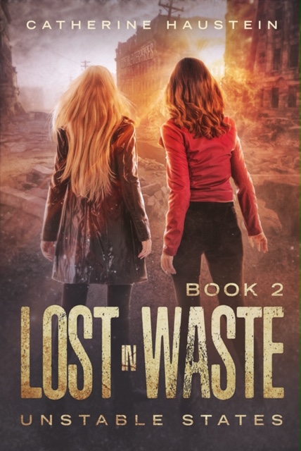
The cover for Lost in Waste was in a contest for books published by independent/small publishers.
http://indtale.com/polls/creme-de-la-cover-contest
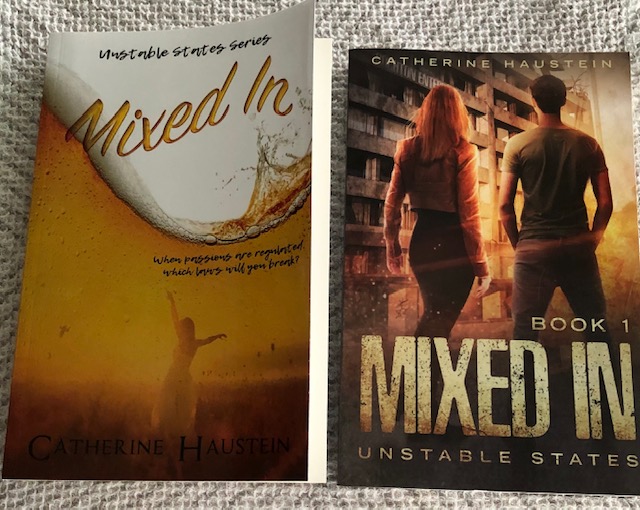
Once my second novel clearly identified the theme and tenor of the series, Book One got a cover make over. It looks less romantic, doesn’t it?
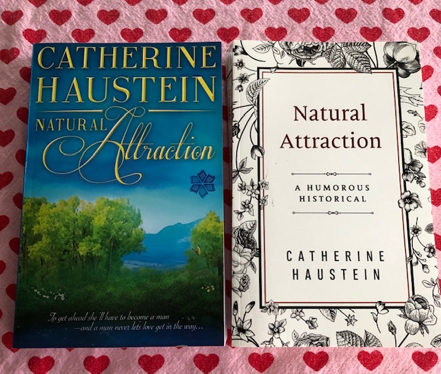
Likewise, the cover of my first novel, a Victorian romanic satire, was simplified over time, as shown below,
When I started out writing novels, I wasn’t sure of my path as an author. As this becomes more established, so do my covers.
What do experts say makes a good cover? Most will say it should be something simple and easy to take in right away with a clear focal point and an easy to read font. It needs to give a quick, big picture overview of what the book is about and catch attention.
Here are some all time great covers.
I didn’t have much to do with designing the cover but it’s been a well-received one. I asked City Owl CEO, Tina Moss, what makes a good cover. She replied as follows:
“The biggest thing with covers is to see the what’s working in the genre. What are readers gravitating toward? Covers like trends change. And some of the top indie authors will actually change their covers yearly or more often. I don’t think that’s necessarily correct as you want to create a brand and not chase trends. But having a brand that aligns with consistency in the genre is key.
For example, your author name should be the same font on your cover, your website, your social media headers, your business cards, your swag, etc. The cover is a tool for marketing and branding.”
Following my CEO’s advice, I attempted to match fonts for this site with my books. How did I do?

I love the re-worked covers, especially the one for Natural Attraction.
Good tips here. Thanks!
LikeLike